Over the past few months my iRiver X20 has been getting less accurate to control to pick songs and change volume. To be fair, it has been a pretty good player, and does look nice and techy. The other thing was that I wanted to be able to switch between music and podcasts, picking up the podcast where I left off. At the time I bought it, podcasts (netcasts truely) weren’t as popular so it wasn’t a feature.
So I’ve been researching mp3 players for a couple of weeks. I researched several: iPod Touch, Creative Zen Fi (or something like that), Archos Internet Tablet, and maybe a few others.
Pros and Cons of Each (Researched)
In no particular order…
iPod Touch
- Touch screen, fairly mature, good UI, certain it does podcasting well.
- App store, many good apps, plenty free.
- Because it’s the most popular, it’s quite likely that vodcasts will just work without having to re-encode.
- No FM radio.
- No replaceable battery (I think this is wasteful)
- iTunes’ library restrictions on importing/exporting foreign iPods (ways around that though)
- Small format playing options.
Mind you, those last two I wasn’t really concerned about: library issue, because you can use third party software if needed, and I was happy with iTunes anyway. Format options: well, while I’d like others, I just don’t need them, any videos can be converted anyway (and it’s reasonably fast, I hear).
Creative Zen-Fi
- Plays other video formats (DivX etc.)
- Has FM Radio
- Supports podcasts (not sure how well, though)
- No App Store
- Just a media player
- No replaceable battery (AFAIK)
OK, so the real advantage here, is that has FM radio, is cheaper (because of less functionality) while still supporting netcasts.
Archos Internet Tablet
- Plays many video/music formats
- Wi-Fi Streaming over network!
- Android OS
- FM Radio
- Could not be sure (even from the manual) about the netcast support.
- Interface didn’t seem as polished as the iPod Touch (or, I preferred the clean look of iPod)
- Non replaceable battery
This is a nice player technically, it can stream files over the network with Windows file and printer sharing, which is cool but not really necessary for me. FM radio again is nice. I didn’t pick this one though, because of the lack of netcast support and the interface, the Android apps may be nice, but I feel (unfoundedly) that the iPod/iPhone apps might be better supported for the time being.
Overall, the FM radio issue wasn’t really an issue when compared to the other features of the iPod – I’ve hardly listened to FM radio on my iRiver for many weeks anyway. (And surely I can get a really cheap one for that, or just take my iRiver along.) Wi-Fi streaming and support for more media formats is cool, but I don’t really have that much media I need to do that anyway.
The iPod Touch
Unboxing
While the packaging was cool (hard plastic box), it was nasty to get open. I peeled the top sticker off with the security barcode and (I gather) it should have come away and hinged on the bottom. But that would have been too easy. Instead one of the corners got stuck and I had to separate the two pieces by removing the bottom sticker acting as the hinge.
Annoyingly, Apple decided to clamp the device to a hard plastic thing, and you are meant to hold the iPod and bend the clampy thing so it opens, freeing the device. I didn’t like that thought at all, so laid the iPod face down on the desk and bend the clampy thing that way. Should have done it on a soft thing like a blanket so as not to damage the iPod when it came of the clamp. But it seems alright though.
When I first turned it on, it kindly told me to plug it into iTunes. So I registered it and did the initial syncing/setup which was fine, except that you need a credit card (though you may not if you don’t make an iTunes account).
iPod + iTunes
When I first installed iTunes before I bought the iPod, I didn’t like it all that much as the views made no sense. The List view shows every song but to customise it you have hunt through the menus to find the Column Browser and add filters. The grid view shows everything with or without album art and I couldn’t seem to filter it (say to just albums). Cover Flow again showed everything even it was wasn’t part of an album (I read on the web though, that it obeys the sorting, still can’t filter it though). Whereas Windows Media Player has preset views for Artist, Album et cetera, and album view only shows songs with album tags (even with big icons or a list if you want). But hey, I don’t have to use iTunes to play music anyway. Once I got used to it though I just stopped using the Grid view and only use the List view now in iTunes.
General
The iPod itself, I’m quite happy with; the main things I’d like to see improved I’ve already mentioned and knew about (FM radio and formats). Oddly, it’s very picky about compilation albums being marked as such in iTunes, but once you tag all the song properly it’s good. I find it takes while to start up after being fully turned off, but it is running a modified version of OSX after all. But the touch screen is responsive, and the accelerometer is nice for the web browsing etc.
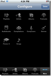
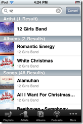
The music player interface is quite good, I find it intuitive (once tagged of course). The Artist view simply scrolls down, selecting an artist lists the songs by that artist, if they have multiple albums they are listed in bold. If the artist only has one album, then that album is shown by itself with the album title in the heading, which is really what you would want, as it would be silly to click an artist only to have to select the only option of one album to get the songs. So once you’re at the list of songs, clicking one starts playing it and adds the rest to the temporary playlist. (On my X20 you could press one to start playing just that song or add the song to the main playlist.)
The Album and Song view are essentially the same, only listing all albums, and songs. Contrasting the X20, to make a playlist of all different songs/artists/albums on the iPod Touch you have to make an On The Go playlist, which is straight forward enough; whereas the X20 treats it as a normal operation. (Mind you, on the iPod, you can sync them to iTunes when you get back home, which is handy.)

Podcasting support is quite good, there’s a view for it, and it puts a dot next to episodes that haven’t been listened to yet. Listening to an ep, you can go fast forward and rewind and go back 30 seconds with one button (which is very handy). Nicely, even if you accidently press next and it goes to the next episode, you can just go back and it picks up where you left off. (I’ve done it too). (Even with only one podcast, pressing Next, just stops and you just start it again to pick up again.) That was one of the problems I had with my previous player, as it wasn’t meant for netcasts, it kept loosing the place while fast-forwarding (because I might not hold the button down enough). Oh, you can download podcasts right on the player over wi-fi too, which is handy, even better it’ll sync back to iTunes. Oh oh, and if sync with unfinished podcast, iTunes itself can pickup where the player left off.
The on-screen keyboard works well for typing normal text, you can double tap caps for a caps-lock, and it learns what you mean and provides suggestions, but they can be ignored if you want. One cool feature is when you push the extra symbols button, and choose a number it stays in that mode allowing you to press more numbers, but if you press a symbol it goes back to letters mode. Which is really what you want, as mostly you enter one symbol at a time, say in the case of “they’re”, and many numbers at a time in the case of … phone numbers.
This is getting longish now, I’ll add more about the apps later. Overall, it has a few quirks but aside from some non-existent features, I’ve found it quite mature and usable. The battery life seems pretty good (so far, will update later with more usage), it adjusts and estimates the battery remaining based on the usage.
Soon, hopefully I’ll post with a general review of the built in apps and anything else I’ve found interesting.


