Thursday, November 11, 2010
MacBook Pro and Mac OSX Love+Hate
Love
The Long battery is quite nice - I seem to get the 7 hours I should, though I haven't ran it on battery for that time in the one session.
I really like the nice shape - it's good how it doesn't look like other laptops.
I love how it's so thin and on top of that it's the same thickness along the whole deceive so it fits in satchels easier.
Like
I like how the base doesn't seem get too hot when I am using it on my lap.
It handles windows file shares quite well, and finds them automatically, if possible.
Dislike
It has no hhd light or optical drive light so I can't tell what it's doing when it stops responding. This is annoying because it's just silly - they waste a hole with an IR port (see below) but don't want to put two colored lights on the front?
I've also discovered that it has no Ethernet lights - not a big issue (you can get it off Activity Monitor, which is a nice touch), but why not just put them on?
The miniDP needs an adapter to actually connect it to anything! I'm putting this in dislike not hate because I understand why they went with it - full DVI ports would have been more then the thickness of the laptop anyway!
Hate
Sharp! When I rest my arms on the front, the edge rubs into the my skin...
Mac OSX
Love
I love how you can Drag and drop to install applications - it's so much easier than having to go through a wizard.
The trackpad is quite good, I quite like the two fingered scrolling and navigate websites with three fingers. (Annoyingly though, swipe to navigate doesn't work in Mac Help...)
Like
I like how you can access the dictionary and calculator in spotlight search. In spotlight, it will show you the first few words of the definition of the word typed into it. Also, if you type math syntax into Spotlight, it will give the answer.
I think it's cool how you can quit a program while still inside option-tab. (By pressing q.)
Dislike
On Windows 7, you can drag windows to the edge of the screen, and it will resize it to half the screen width, so you can place them side by side. Mac should have this feature (or at least something similar), because it's supposed to be better than Windows.
I'm putting this in Dislike because while XP did have the ability to tile windows, it wasn't very visible, Windows 7 made it obvious but (to be fair) only came put recently.
I don't like how the red close button isn't consistent - sometimes it exits, sometimes it just closes the window. But this isn't too much of a problem because command+q exits the program completely anyway.
Hate
There's no global font scaling like on windows. On Windows, you can increase the global font processing size to make test look bigger. On Mac, everything is so small... This is partly worse because my MacBook Pro anti-glare only comes in high resolution. Why doesn't Mac have this ability when Windows does?
The green zoom button is useless in safari - if the browser is the same size as the web page, zoom does nothing at all.
There's no grouping of file types in Finder like on Windows. Even since XP, we could group icons in Explorer by file type, date, first letter or size. This separated groups of icons with a title and a border. I hate this because Windows has had this feature since 2001, and it can't be a difficult feature to implement.
Can only resize windows from the bottom-right - why? That means that you have drag the window opposite of where you want to resize it.
Monday, October 18, 2010
MacBook Pro unboxing!
My custom MacBook Pro finally arrived yesterday, so I was able to pick it up today. I ordered a 15” MBP with anti-glare screen which also became higher res (the anti-glare was only available in high res).
So of course, I took photos of it while I was unpacking it and setting it up.
(spoiler saves if you are buying one…)
(spoiler saves if you are buying one…)
(spoiler saves if you are buying one…)
(spoiler saves if you are buying one…)
(spoiler saves if you are buying one…)
(spoiler saves if you are buying one…)
(spoiler saves if you are buying one…)
(spoiler saves if you are buying one…)
(spoiler saves if you are buying one…)
(spoiler saves if you are buying one…)
(spoiler saves if you are buying one…)
(spoiler saves if you are buying one…)
(spoiler saves if you are buying one…)
(spoiler saves if you are buying one…)
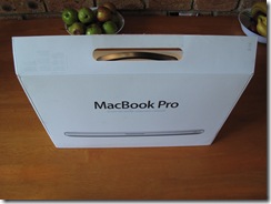
Goodness, the box is thin! Saves packaging…
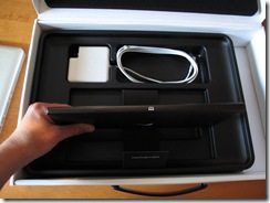
Ahh so is why: it just has the machine itself and piece of foam to help protect it. I guess everything else is underneath… In the box on the side is an extension cord for the electricity. I like how they included a pull tab to make it easier to get the laptop itself out.
Underneath, is the power supply transformer and documentation.
The top piece of foam. Lovely huh…
Hey! They even put a little book icon on the packet that contains books!
“Everything Mac”. The basic printed manual. “Everything else”. A packet of warranty info and backup media. Oh, oh! And stickers!! With Apple logos, just in case someone actually sticks them to their $2700 laptop!
Having the extension cord separate to the power plug is kinda cool.
The back…
Gotta read the EULA inside “Everything Else”.
Heh, done it now…. Cute….
The apple on the lid – it even has real depth!
The cool light on the power adapter changes colour depending on charge status. I like things that light up!
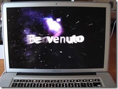
Wow, a welcome movie!!
Goodness it’s sharp! Could almost cut yourself on that thing!
Glowing keyboard!
I’ll try to post more little tidbits later!
Sunday, October 10, 2010
Naked iRiver x20
I decided to take apart my old iRiver x20 to see if I could make the jog-dial work properly again, otherwise I’d just take it to the electronics recycling centre, or give it away for parts to electronics friends.

(Wow, a replaceable battery, what will they think of next)
 Just a matter of prying the top open along the edges.


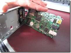
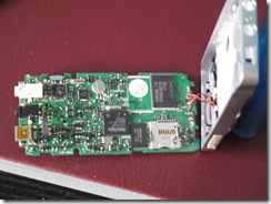
Hmm, not much to it really… I mean, it’s pretty thin…
More random images.
iRiver was kind enough to use normal screws and standard construction methods, so it was a very simple job to get it apart, I didn’t try to remove any components (I have no need for them). I couldn’t do anything with the jog-dial I couldn’t see how to get it apart, and the contacts have probably worn off anyway.
I’m donating these images to the community on a CC license (non commercial, attribs, share alike). If you use them for anything, please just tweet me @anthc – I’m just curious. DM me, for commercial use….
iRiver Photos by @anthc is licensed under a Creative Commons Attribution-NonCommercial-ShareAlike 3.0 Unported License.
Saturday, June 26, 2010
iPod Touch 3G iOS 4 Install
10:03 – I click Update (after already having downloaded it.)
Here, it does stuff and disconnects it and reconnects it.
[photo]
It’s now 10:10 AM
iTunes is backing up… ?
10:11 and iPod is restarting. Now it’s at the passcode screen.
iTunes is optimising all my photos again. And Syncing 10:12
10:17, still syncing and optimising. Why does it have to optimise all three thousand four hundred photos again? Did the quality improve? Speaking of which, why, when I updated to iTunes 9.2, did it update some songs on the iPod that I hadn’t played or edited in the meantime anyway?
While that’s still optimising (10:30) I thought I’d look around iTunes:
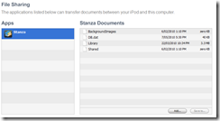
That’s new, you can transfer data between apps now. That’s the only app I have can so far, because they release an update for iPad as well I think, but I have yet to update the other apps. (Still got around 2,000 photos to go… This is before I can even try out iOS 4…)
Still optimising photos at 10:55.. 11:06 and only ~200 to go. Getting excited… 11:08 and iTunes now has to copy them all over to it.
At 11:17 iTunes finished syncing the photos to the iPod and finished and is OK to disconnect. Now to see.
Initial thoughts:
- Well, the lockscreen looks the same.
- Oh, a new Safari and Calculator icon.
- Oh YAY! It supports the smart classical playlist now!
- It seems that apps have be updated before they will multitask, I don’t think that any of my apps have been updated and they seem to exit.
- My photos are fine (not blurry, though I’d hope so after spending an hour optimising them) and all my apps seem to have data still.
Maybe the photos are a bit higher quality?
So far though it seems quite responsive and the upgrade was quite painless. Now I just need to update the apps. What do you think?
Saturday, June 19, 2010
Things I’m most looking forward to in iOS 4
Multitasking Support
I know this is one of the main items everyone keeps mentioning, but I look forward to it so I can change apps without loosing where I’m up to, if all I want to do is check something else quickly. I do hope though that you can change the action to swap to say hold-for-1.5-seconds, as I think it’s too easy to miss the double tap on the home key and exit. (Further reading suggests that apps are never exited, will have to read up on the tent-poles again)
Device editable playlists
You, just might want to alright…. Maybe they’ll fix the Classical auto-gen playlist so it actually works on my iPod Touch….
App Folders
It’s too easy to get too many apps and loose track of which screen they’re on. Apparently, you can put them on the dock too. Hopefully you can have more than 9 per folder though…(Further reading says 12, but if you have only 9 they don’t arrange logically)
Spellchecking
It’s a spellchecker, about time too, even Firefox had one earlier and it’s community developed…
Orientation Lock!
Apparently there’s a button in the new dock to lock the orientation. Good grief that’ll be good! Looking at photos it insists on rotating has always been a pain. Apparently the Photo app now supports landscape orientation which would be good for those albums with long names….
Improved Album Viewer
Apparently, they’ve added track numbers, time display, and art to the album view which I think makes it a better player. I like how everything seems to fit in to the style. http://gizmodo.com/5513121/the-hidden-secrets-of-iphone-os-4/gallery/15
Others Things
- Cellular Data: On/Off – I don’t have an iPhone so I don’t know what this does, but turning things on or off is always cool.
- Web and Wikipedia search from Spotlight – this could be handy actually.
- Disable Location Services on an app by app basis – again, more control is better.
- Failed SMS Notification – Wow, I’ve had this on my Nokia for many years now…
- Birthday calendar – gathers birthdays from your contacts, more appropriate for iPhone though (My Nokia doesn’t actually have this)
Saturday, May 22, 2010
Wednesday, May 19, 2010
Activate?
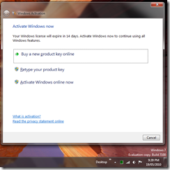
This little gem popped up tonight. I’m not quite sure how activating the Release Candidate is going to work though.
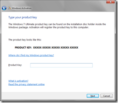
Oddly, typing in the product key actually worked. (Forgot to take a screenshot though.) Who knows what it achieved though…
Sunday, May 2, 2010
Steam vs Steam
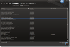
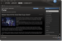
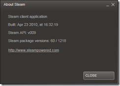
VALVe release a visual update to their content distribution client Steam. I felt like comparing the update and the old version.
Not much to say about the update really, if Valve played their part well, it was only a UI update (overhaul) and no platform functionality was lost. Overall, it’s certainly a lot neater, a few issues usability which I should probably report, but, platform aside, it’s a game launcher.

